First and foremost, you have to understand that I am colorblind. Like, really, really, colorblind. So more than likely you will get a laugh at what I perceive the colors to be.
For this first one, I kinda banged my head on the desk trying to work it out, but I almost feel like it's a tetradic color scheme because of the range of colors used, along with their basic use. I feel would be a generally cool color temperature because of how the sky and water use most of the space.
Now emotion is going to vary greatly from person to person, and I don't know that you can necessarily establish an emotion in one word. I look at this image and see the same feeling that you might get before undertaking a large project. The excitement of the potential final result with a slight pinch of disdain. The feeling of work ahead.
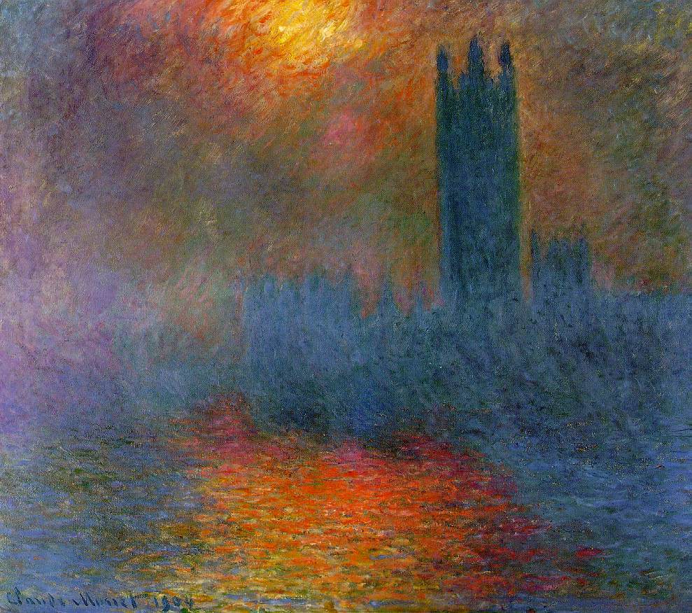
For this painting I felt like even a colorblind kid could see what's going on! The artist uses a triadic color scheme to convey the "sun breaking through the fog". The use of the cold color temperature for the fog is broken up by the bursts of warm red and yellow hues, it really gives a sense of "visual tension" or "pushing and pulling" as the book would say.
For some reason I find this image comforting, in a way. The idea of the sun breaking through a thick fog and rolling out a beautiful range of colors conveys to me a feeling of rejuvenation, a new day.
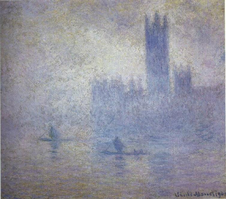
Analogous is the initial thought when looking at this particular piece...Its very cold and limited color palette that, for some reason, does not bode well with me.
I'm thinking that perhaps this piece does not sit well with me is because I feel that it is lonely. As if the artist was having a bade day, was in a slump, etc. I mean come on, the guy was sitting in the damn fog where you could hardly see anything painting. Its lonely.
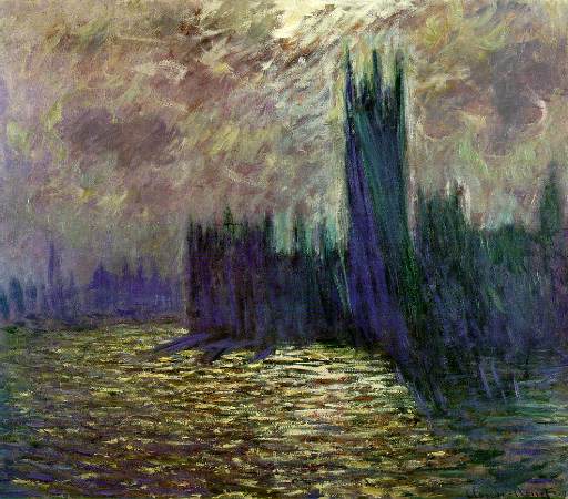
I've sat here staring at this piece for about fifteen minutes now, and I'm just not exactly sure. My best guess would be a complementary color scheme because of the strong use of the opposing cool, darker blues with the warm temperature colors. Of all of the pieces I feel like this on in particular stands out over the others as it is so different. While all of the others use a soft dabbing and blending, this has a very strong use of straight lines and brush strokes. It's almost as if the artist was angry and aggressive with his painting technique here.


No comments:
Post a Comment